A brand that celebrates the pleasure of authentic Italian dining.
ABOUT THE BRAND
Piacere Ristorante is an Italian restaurant located in the heart of Plovdiv, Bulgaria — a city known for its rich cultural heritage and vibrant culinary scene. Despite its authentic cuisine and charming location, Piacere struggled to attract new customers due to an outdated brand image, zero online visibility (including Google Maps), and a logo that no longer met modern design standards.
This project began as a full-scale rebranding effort aimed at repositioning Piacere as a warm, inviting, and authentic dining experience inspired by the Italian concept of la dolce far niente and Plovdiv’s own spirit of ailyak. The goal was to create a cohesive visual identity that would help the restaurant connect with its local audience, increase foot traffic, and build a strong online presence.
Key problems addressed:
• Lack of brand recognition and differentiation in a competitive market
• Outdated logo and inconsistent visual style
• No social media presence and missing from key platforms like Google Maps
• Limited customer engagement and low visibility, both online and offline
My contributions:
Brand Strategy & Creative Direction
• Developed the brand’s visual and conceptual foundation, aligning it with Piacere’s mission and target audience.
• Developed the brand’s visual and conceptual foundation, aligning it with Piacere’s mission and target audience.
Logo Design & Visual Identity
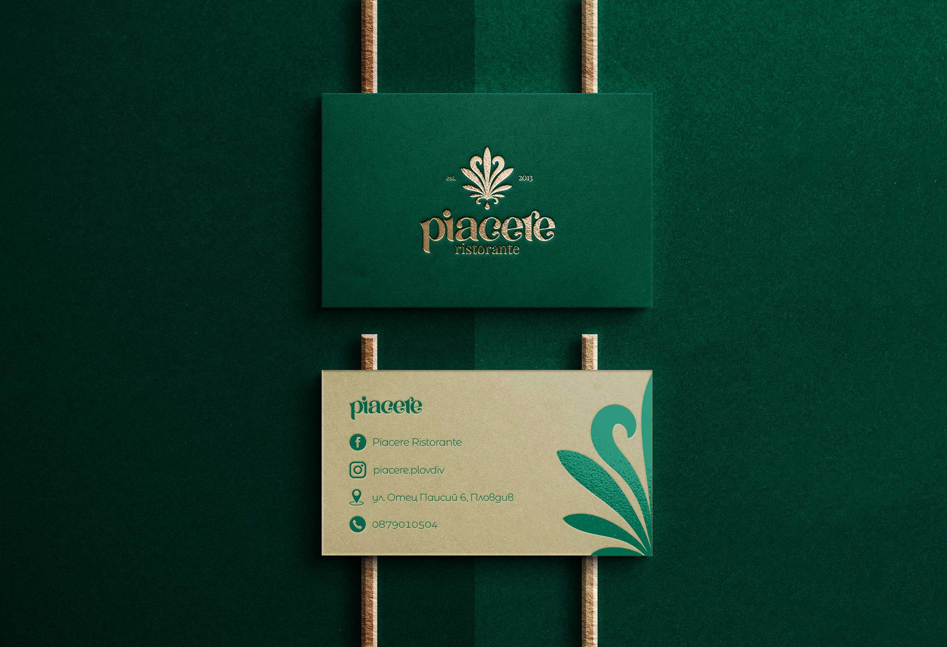
• Created a modern and flexible logo system, color palette, typography, and graphic elements to establish a cohesive brand language.
• Created a modern and flexible logo system, color palette, typography, and graphic elements to establish a cohesive brand language.
Menu & Print Collateral Design
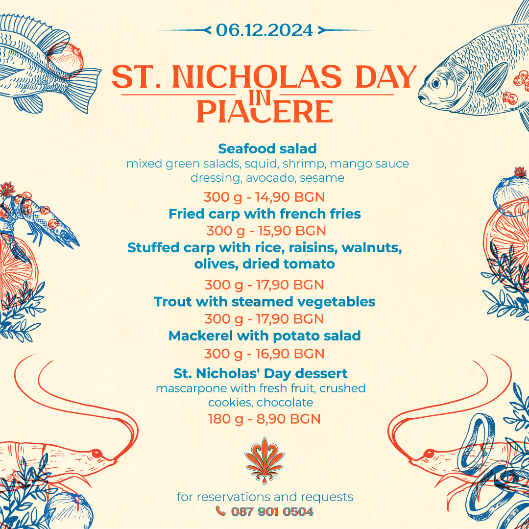
• Designed branded menus and in-restaurant materials to enhance the dining experience and reflect the visual identity.
• Designed branded menus and in-restaurant materials to enhance the dining experience and reflect the visual identity.
Social Media Design & Content Planning
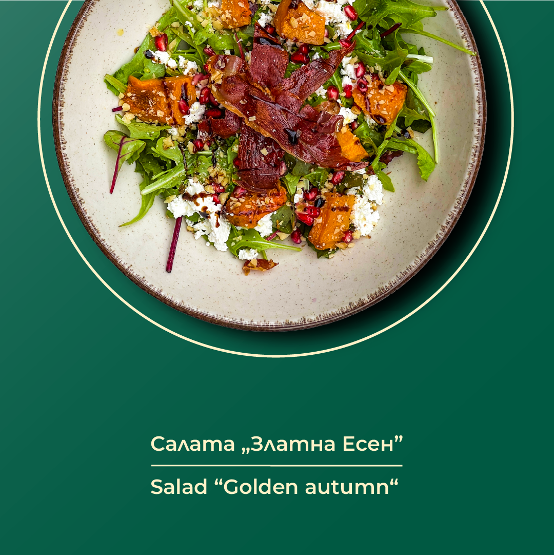
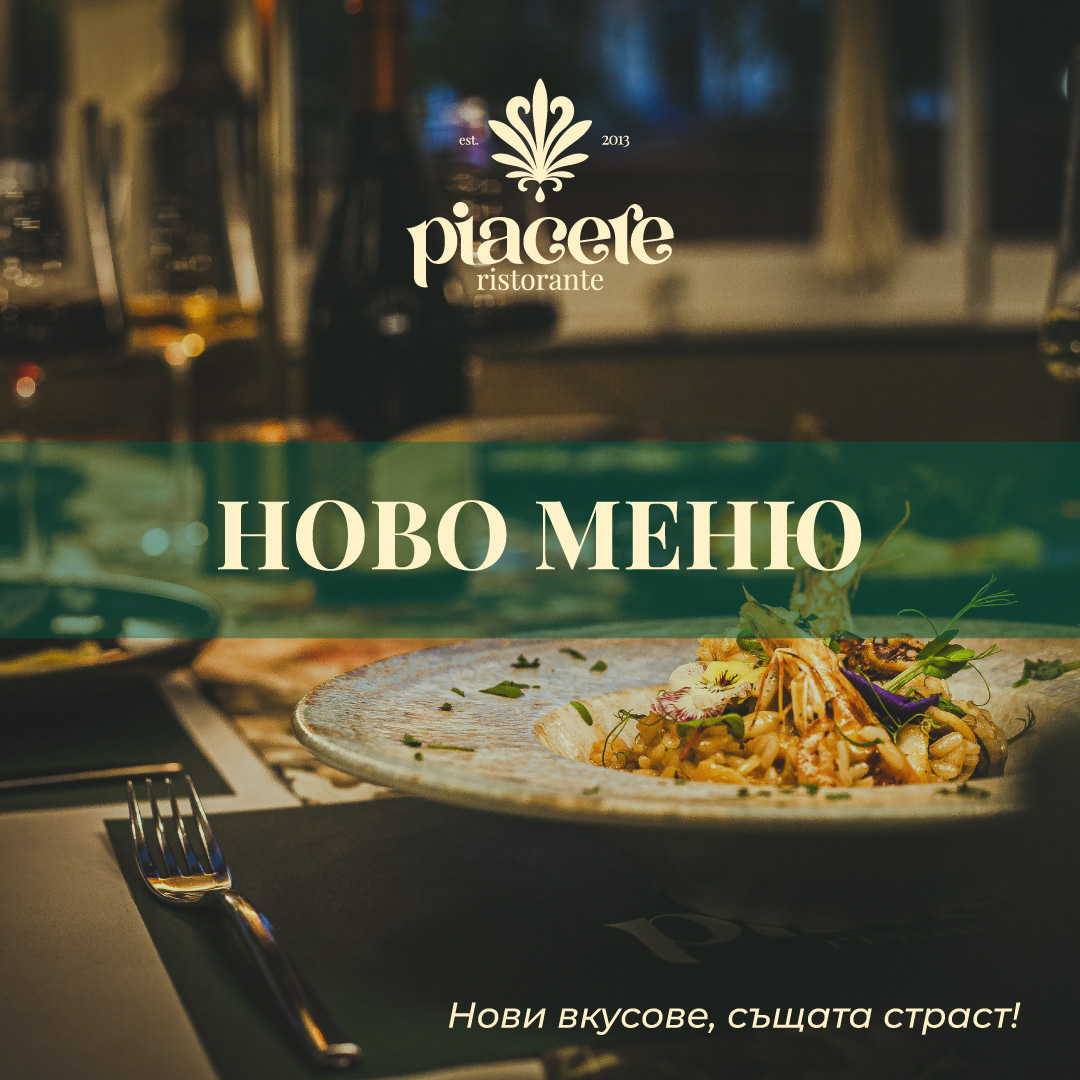
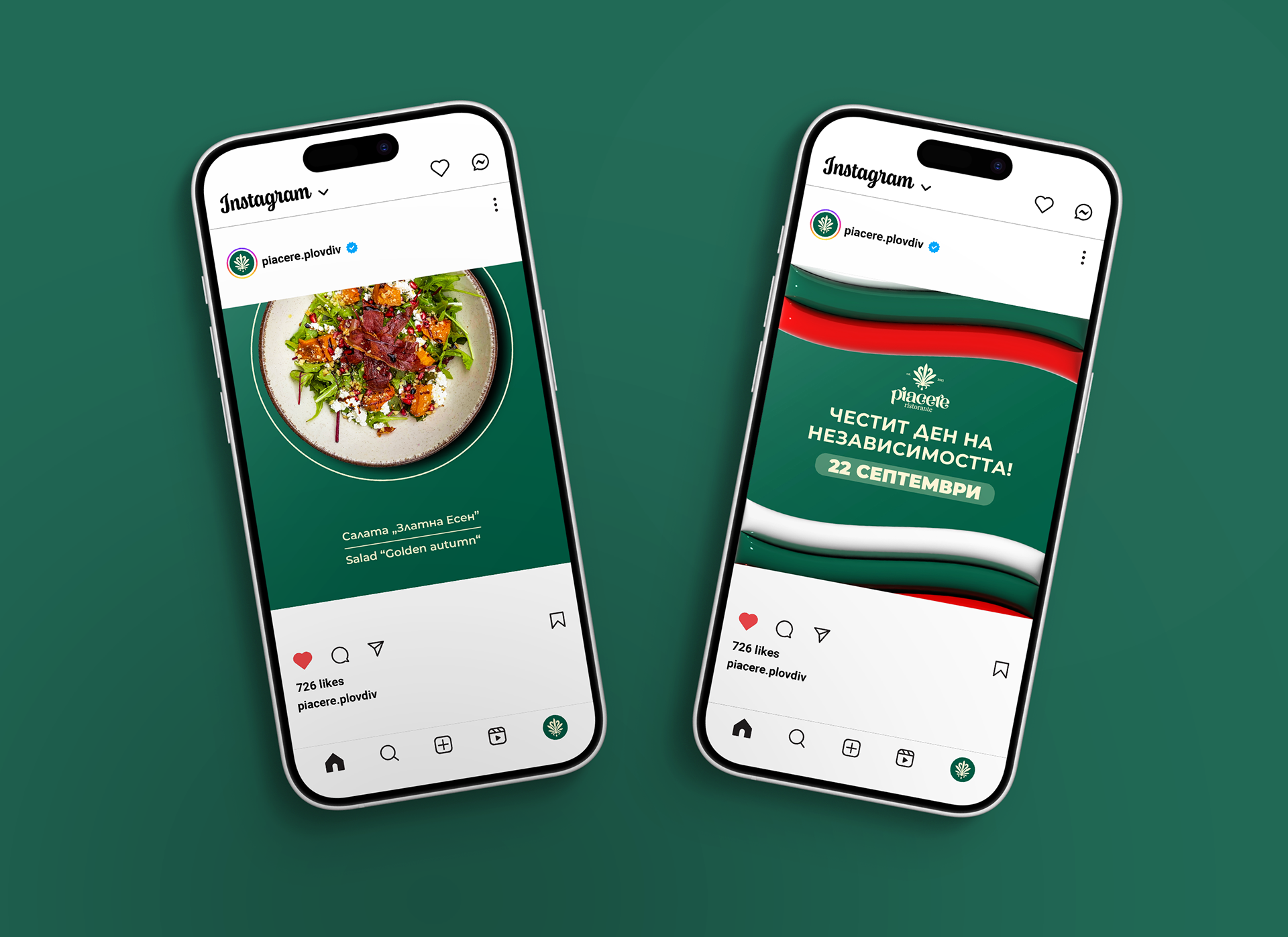
• Built a library of post templates and brand-aligned content for platforms like Instagram and Facebook, helping establish a consistent digital voice.
• Built a library of post templates and brand-aligned content for platforms like Instagram and Facebook, helping establish a consistent digital voice.
Photography & Art Direction
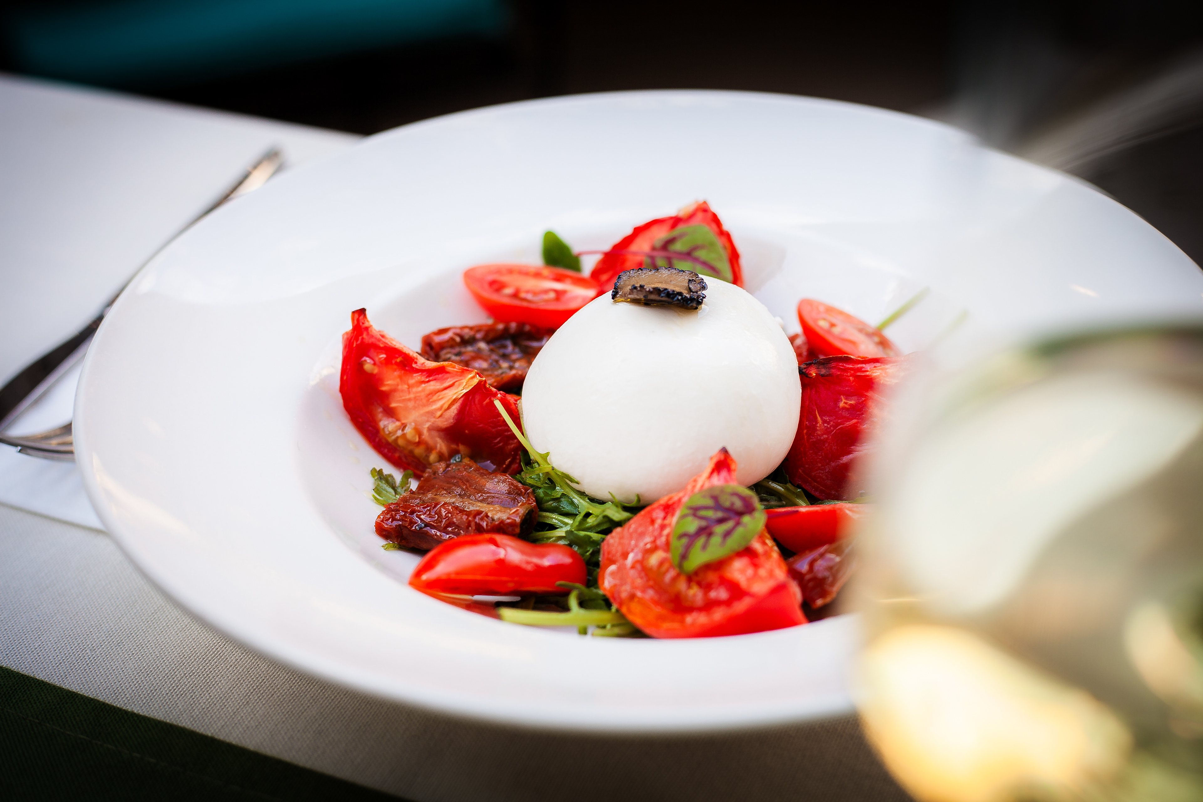
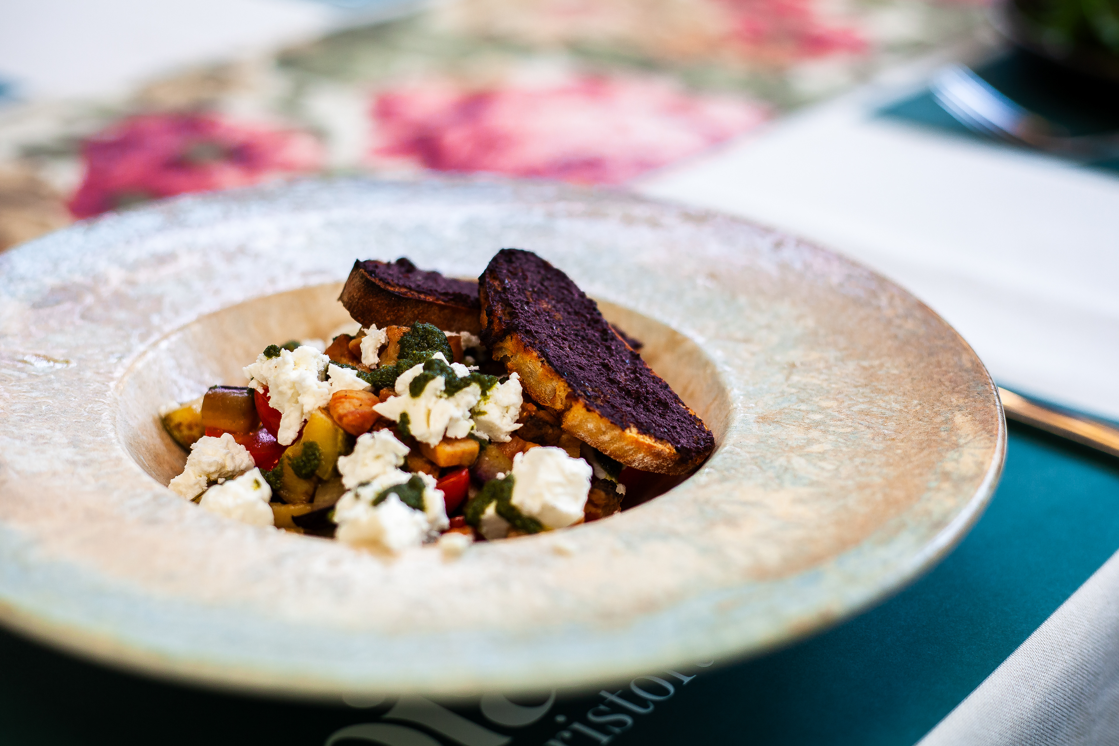
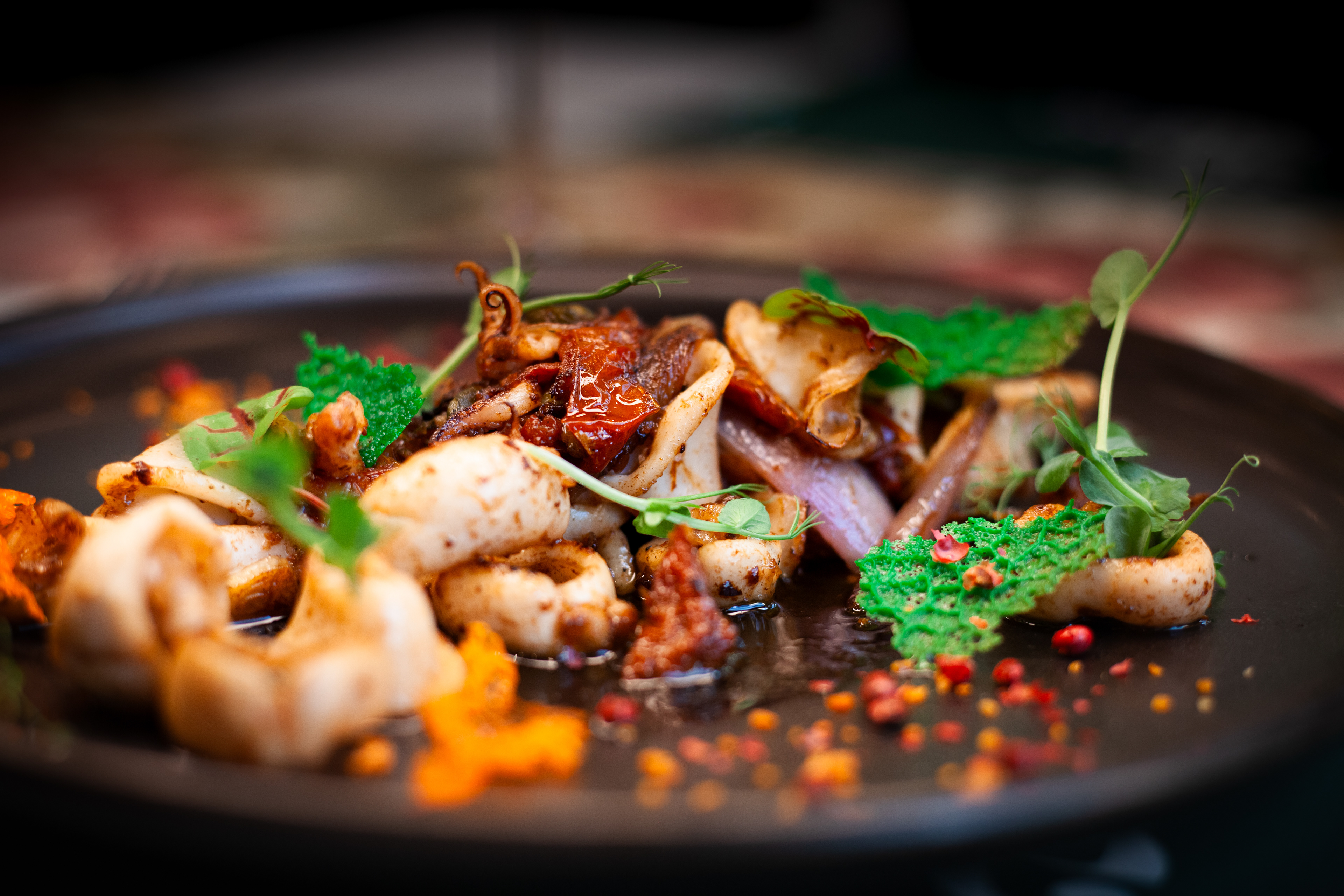
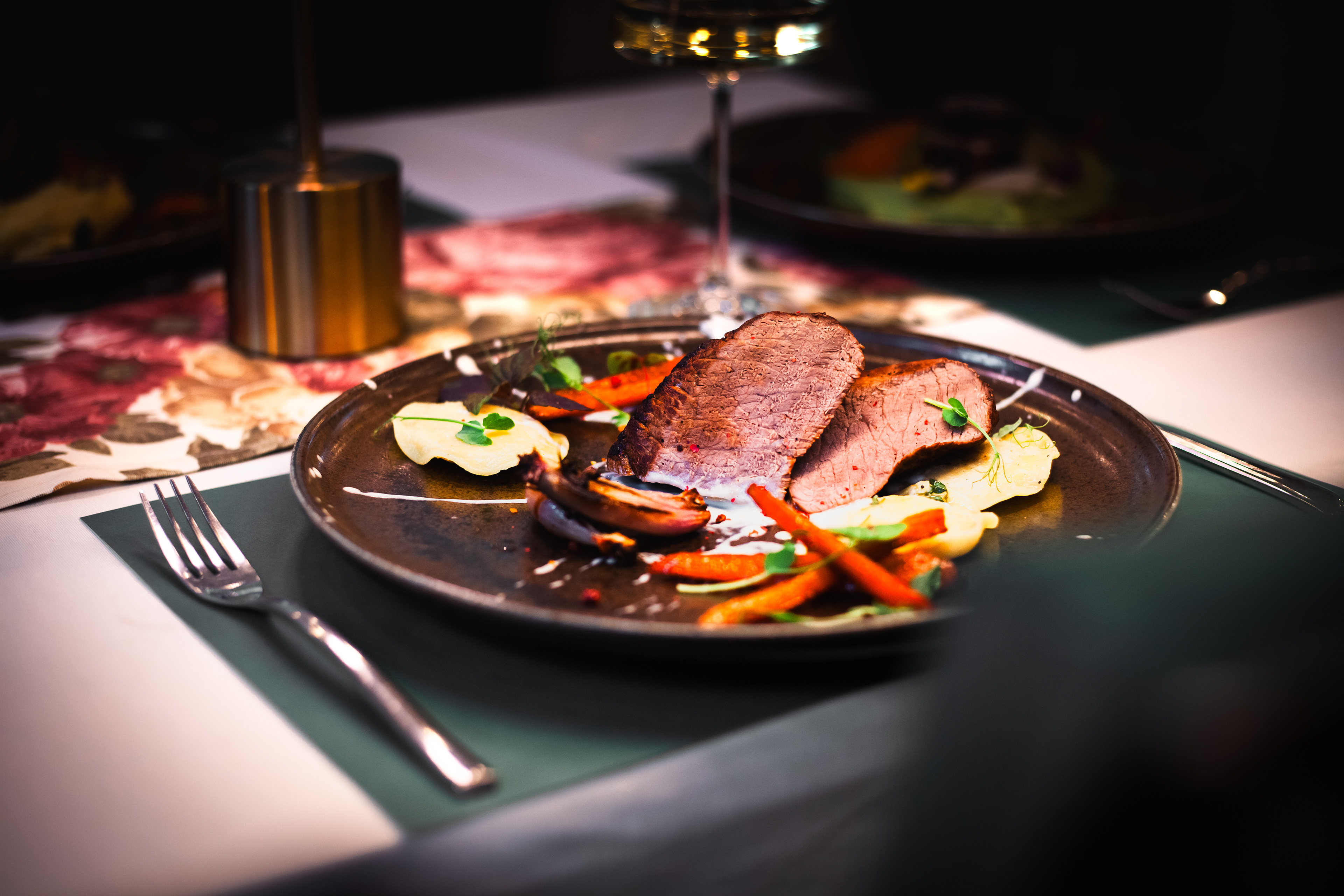
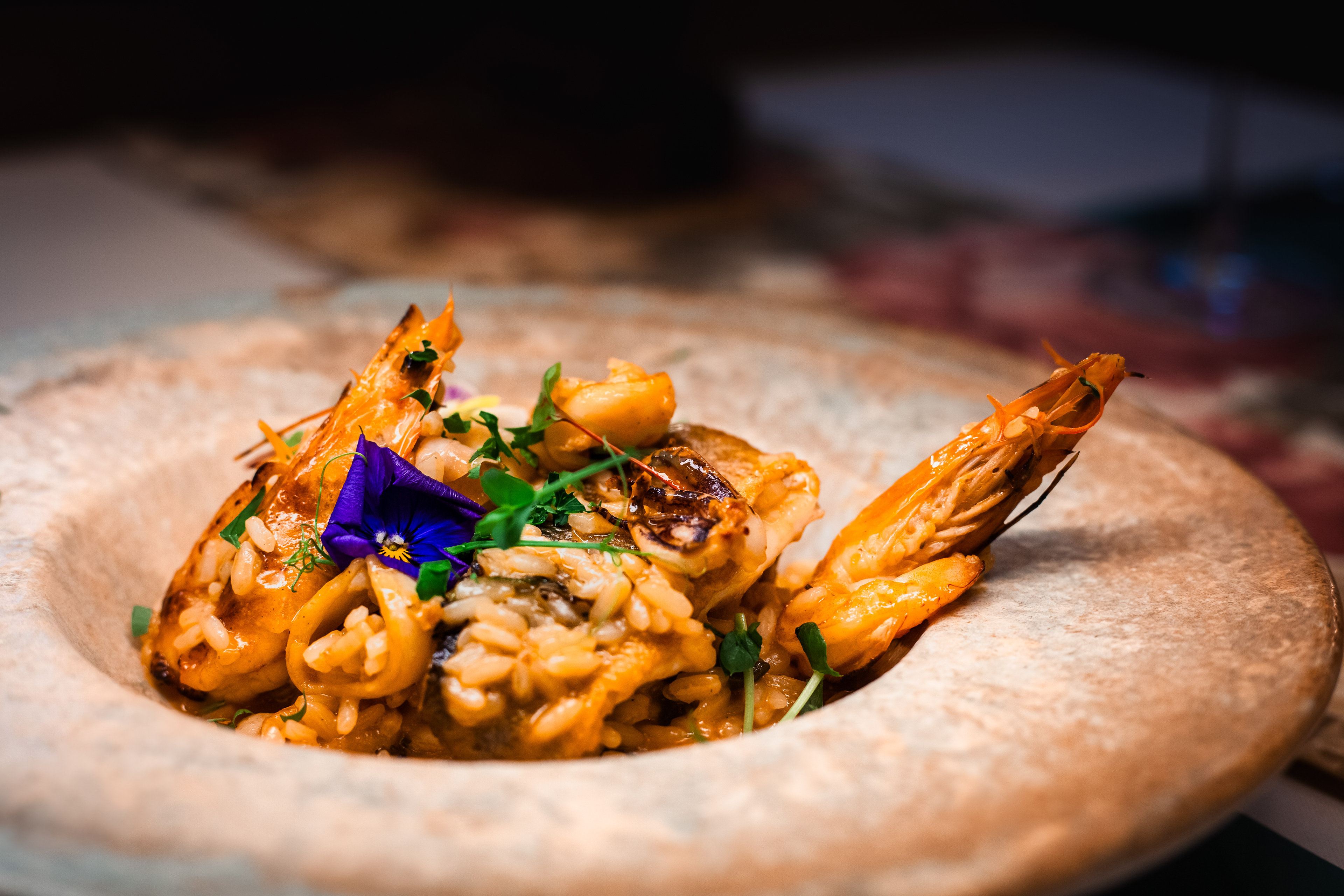
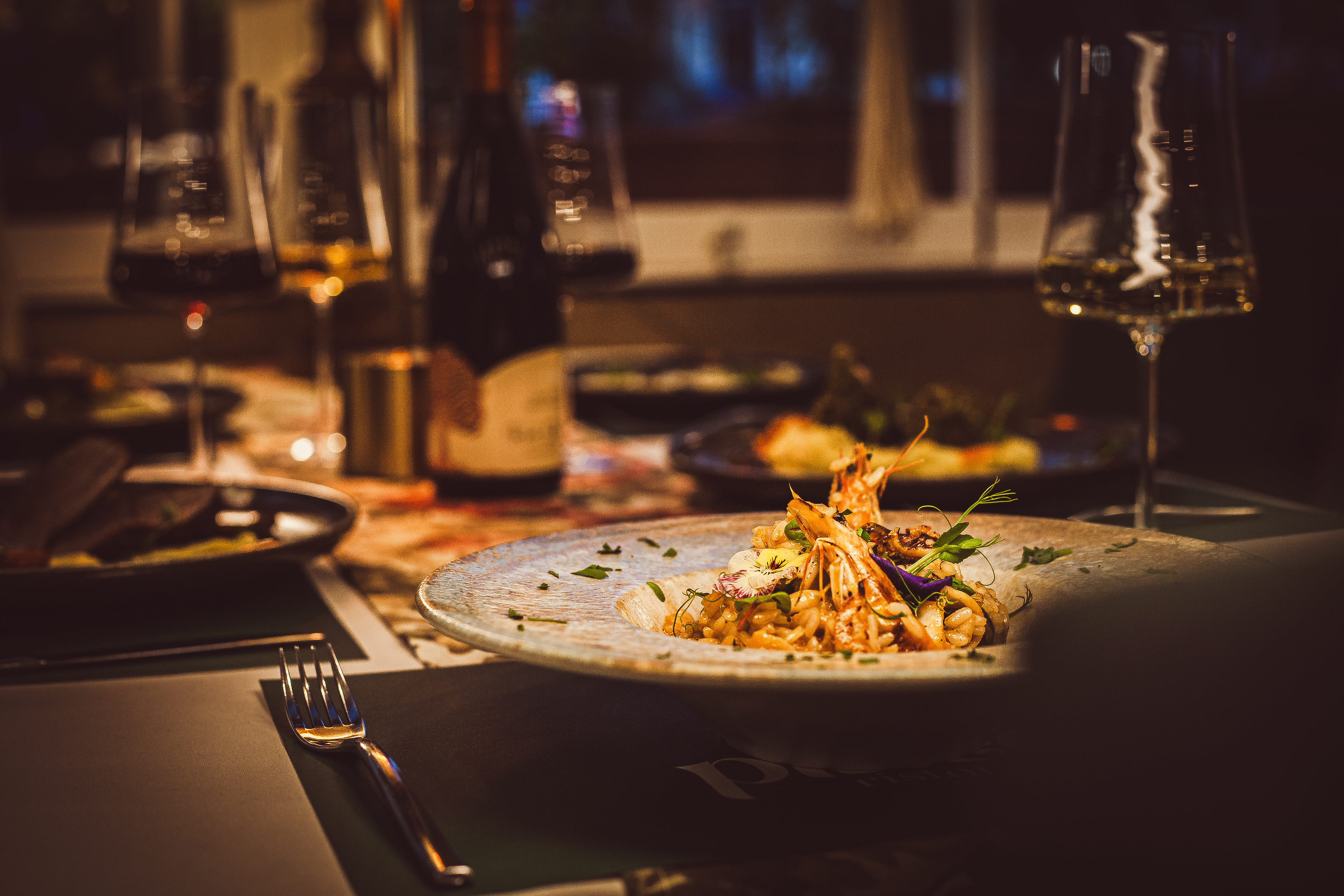
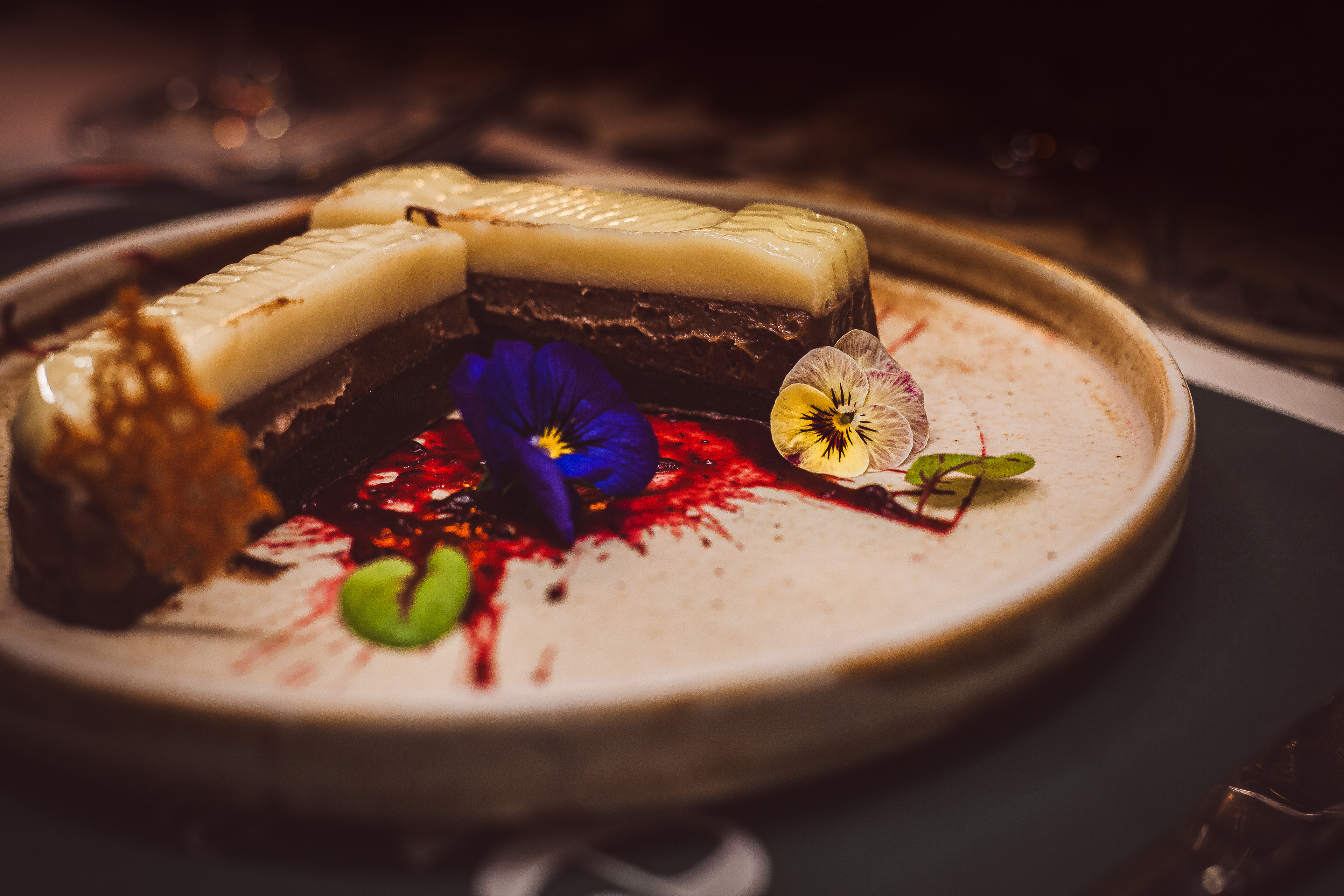
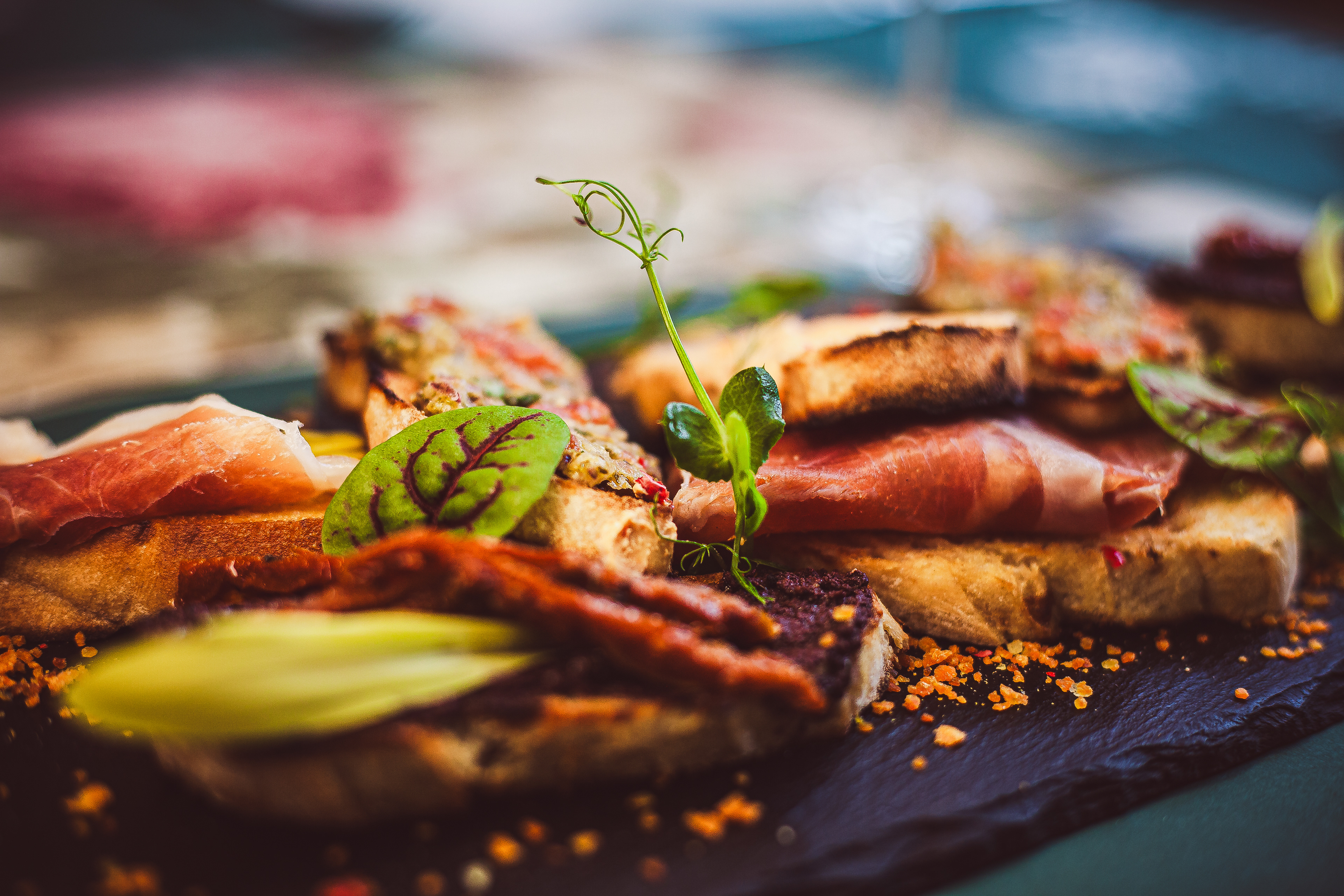
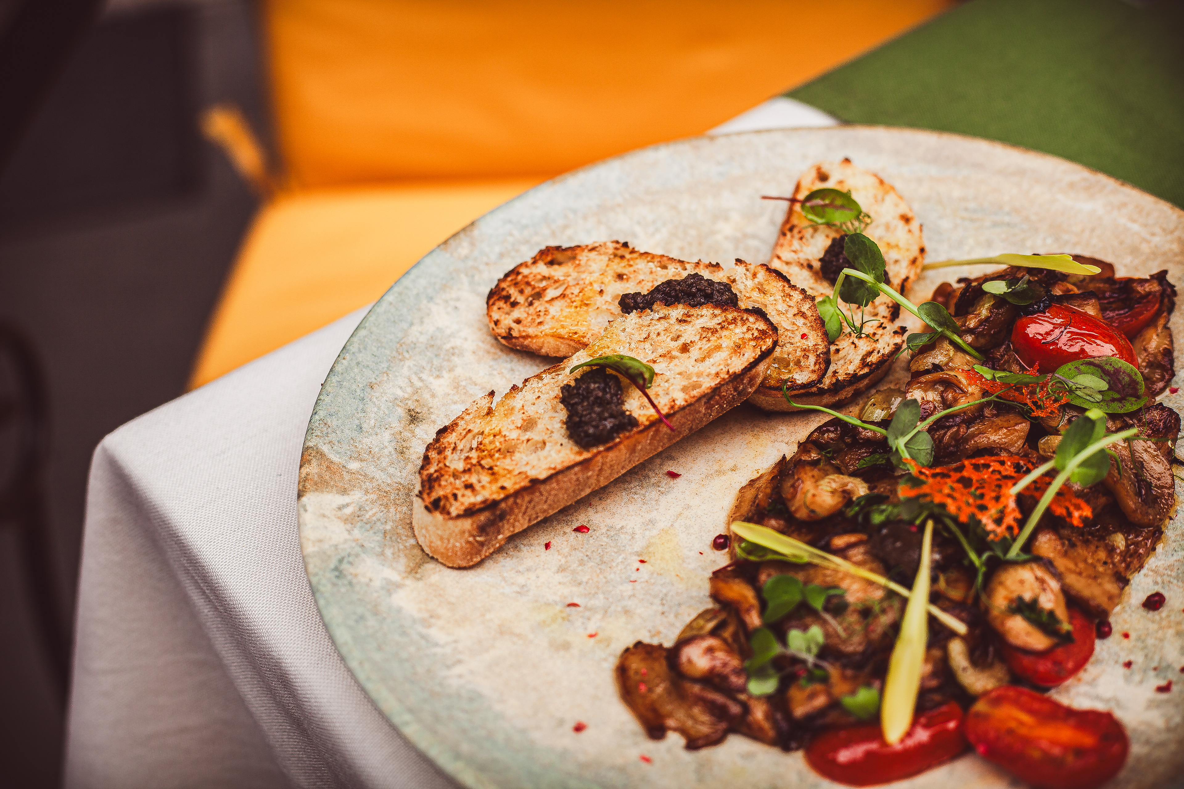
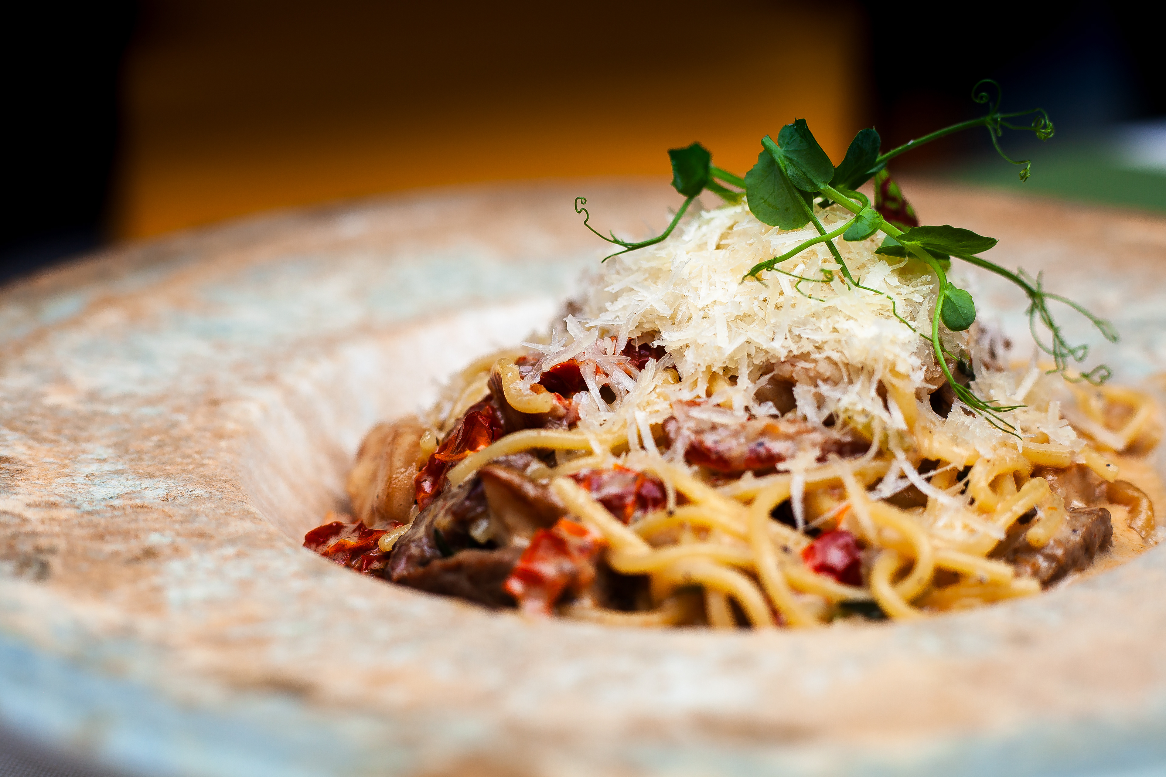
• Captured original food, interior, and lifestyle photography to support the brand's storytelling and marketing materials.
• Captured original food, interior, and lifestyle photography to support the brand's storytelling and marketing materials.
Digital Presence Setup
• Helped launch the restaurant’s online presence, including social profiles and Google Maps listing, to improve discoverability.
• Helped launch the restaurant’s online presence, including social profiles and Google Maps listing, to improve discoverability.
The result is a modern, refined brand that not only reflects the soul of Italian and Bulgarian hospitality but also stands out visually — inviting more people to discover the pleasures of Piacere. Today, the restaurant enjoys higher visibility, stronger brand recognition, and an identity that truly matches the experience it offers.
LOGO
PRIMARY LOGO



OLD LOGO
NEW LOGO
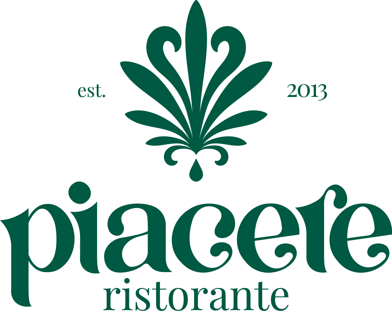
The ornamental logo design features five symmetrical leaf elements on each side, inspired by the olive tree, symbolizing the five-course structure of traditional Italian cuisine. At the center, a stylized olive oil drop reinforces the connection to Italian culinary heritage, serving as a subtle yet meaningful conceptual anchor
LOGO VARIATIONS


Flexible logo system for various brand applications.
COLOR PALETTE
MAIN COLORS
SECONDARY COLORS
TYPOGRAPHY
MENUS AND MOCKUPS
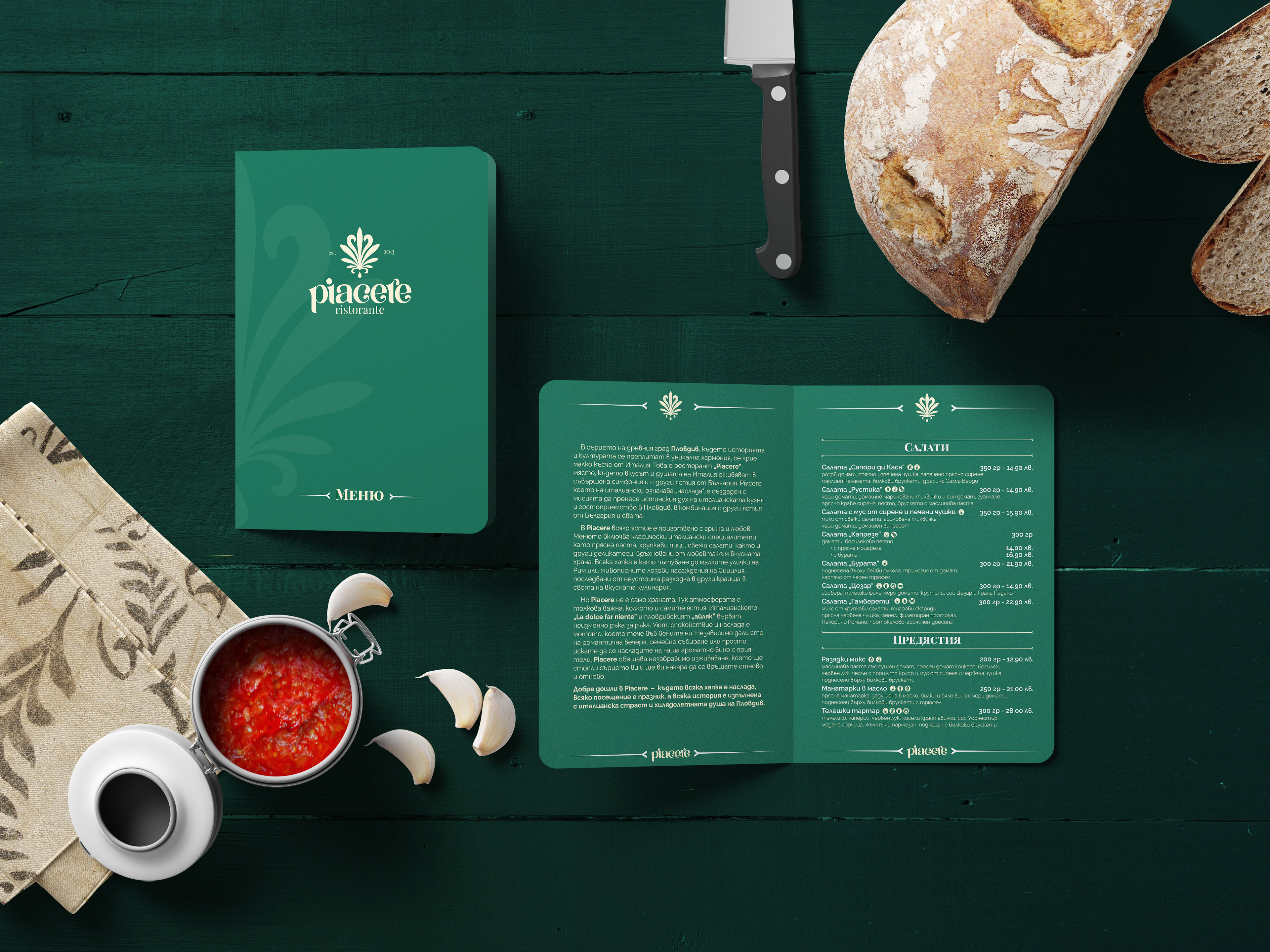
Main menu
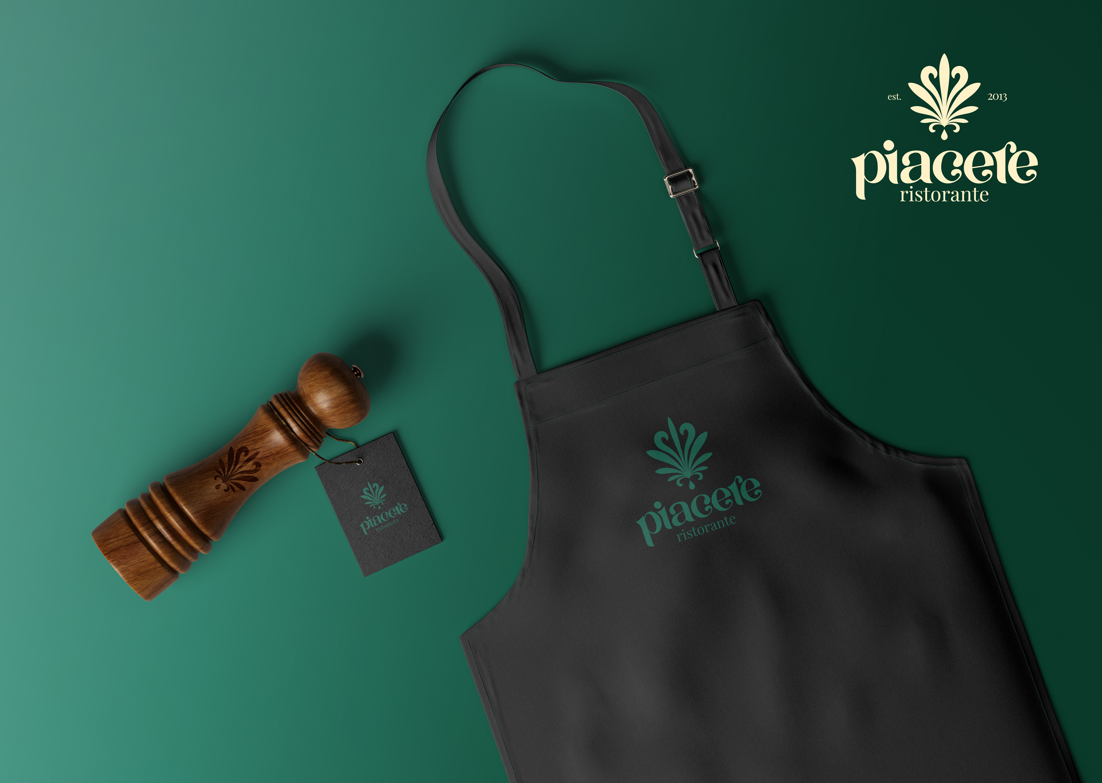
Apron mockup
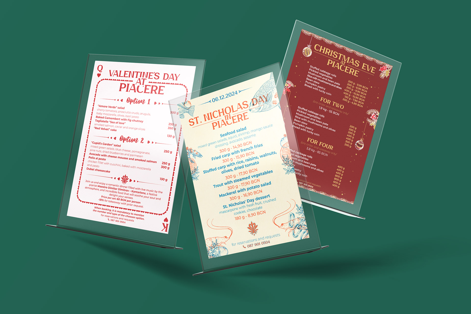
Event menus
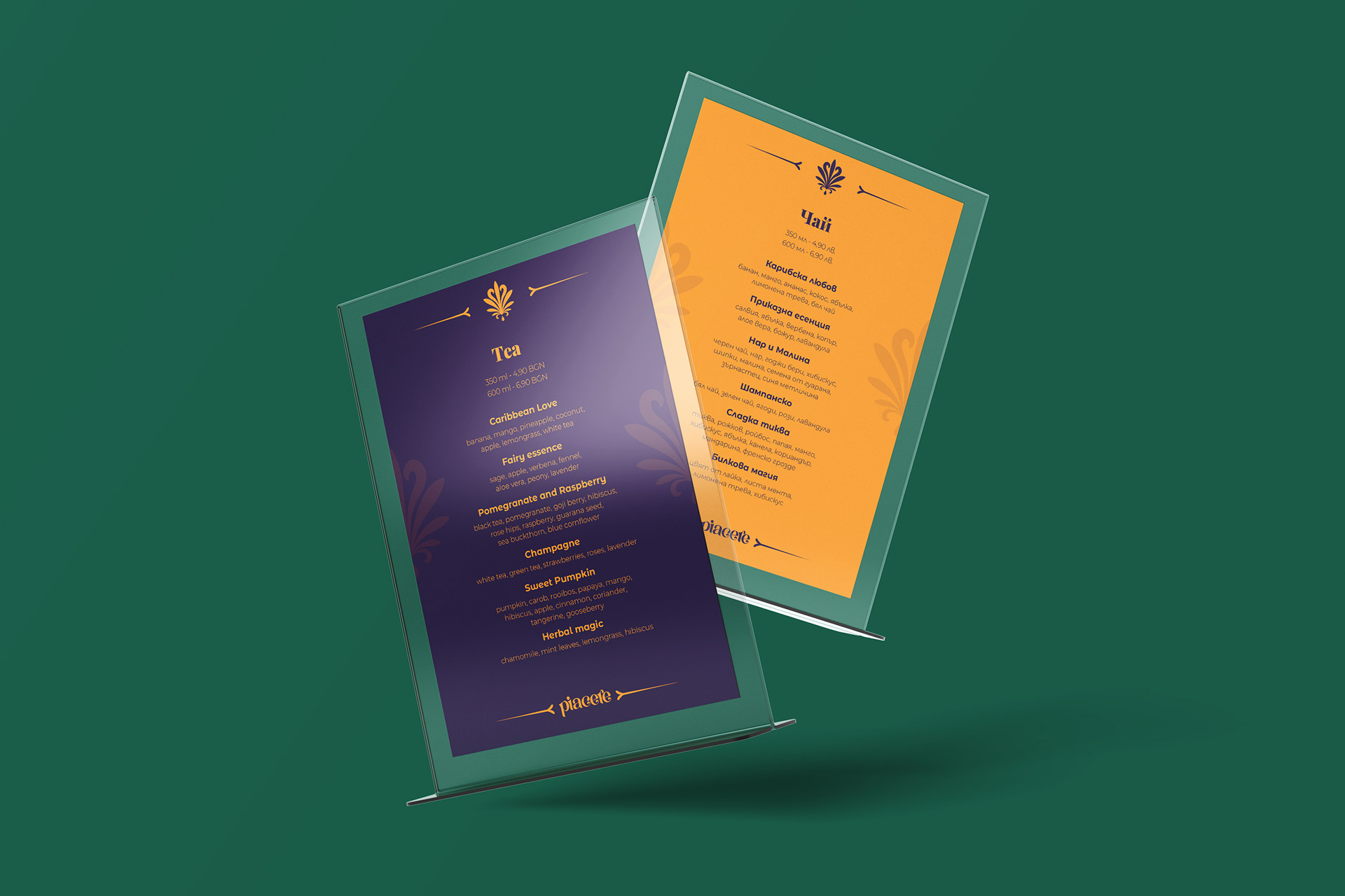
Tea menu
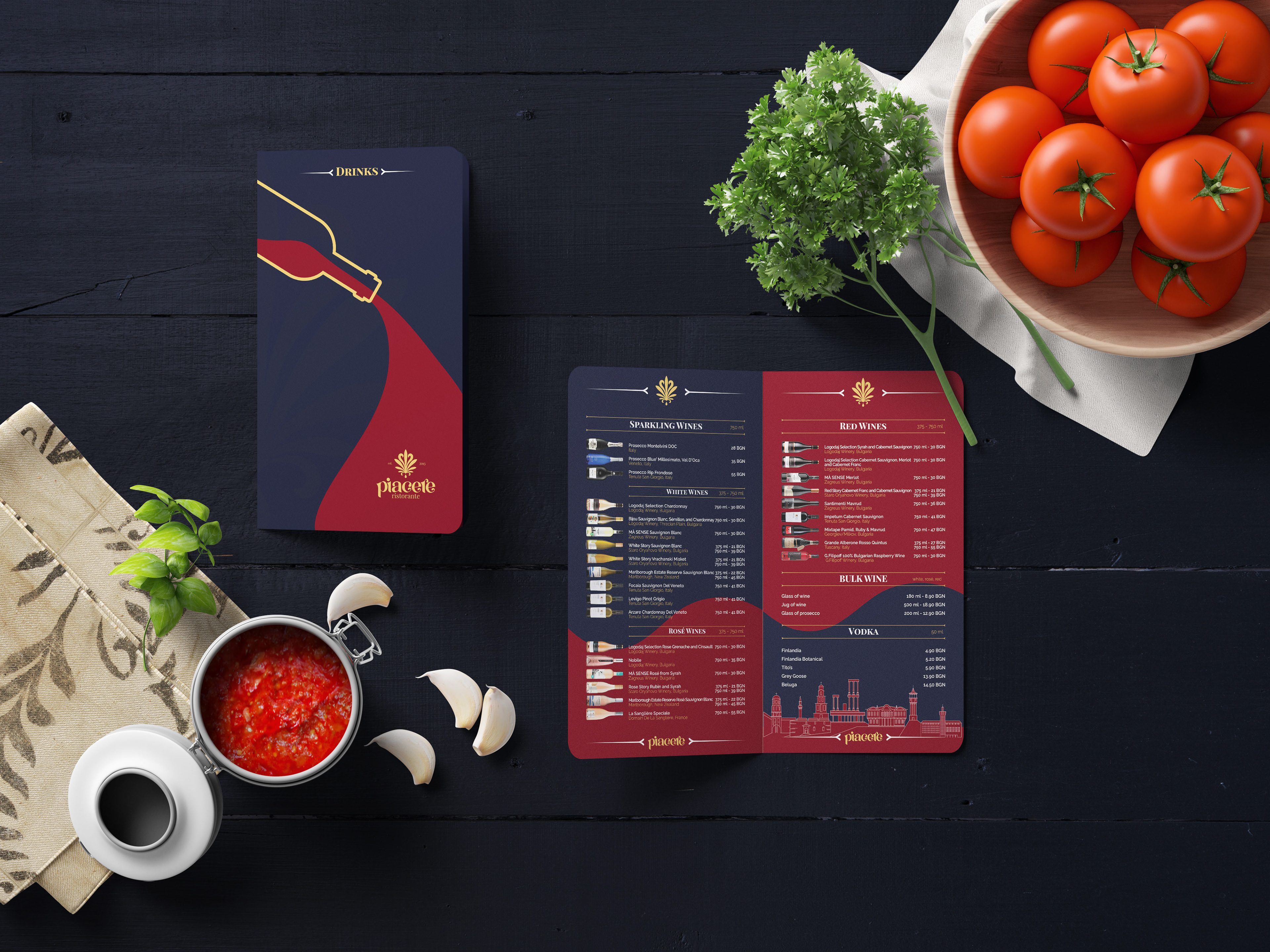
Drinks
FOOD & INTERIOR PHOTOGRAPHY






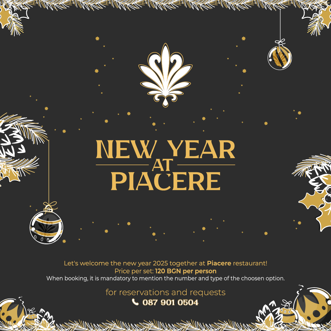
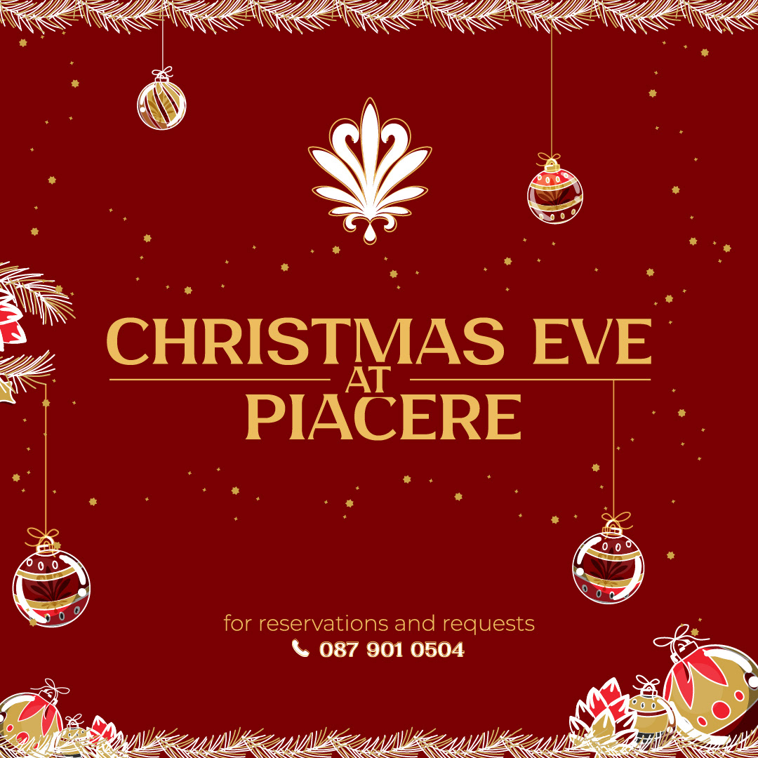
SOCIAL MEDIA POSTS




This project focused on repositioning Piacere Ristorante through a complete brand overhaul — addressing outdated visual assets, lack of digital presence, and low customer engagement. The new identity system was designed to be flexible, modern, and rooted in cultural relevance.
Key outcomes include a cohesive visual language, improved brand visibility, and a stronger connection between the restaurant’s concept and its customer experience. The result is a brand that now communicates clearly, performs across platforms, and aligns with its core values.


